Inspiration
4 Engaging Websites That Nail Parallax Scrolling

Framer Blog
Have you ever landed on a website and found yourself fully immersed, as if the page was pulling you in? Chances are, these websites have used parallax scrolling—a popular web design technique where layers of content shift and move, creating a sense of depth that draw you in.
Parallax scrolling works by moving background elements at a slower pace than the foreground which produces a subtle 3D effect. It’s a powerful tool to captivate your visitors and make your sites memorable and engaging.
Modern website builders like Framer make it easier than ever to create these immersive and interactive experiences, without needing to learn how to code. Take a look at these 8 dynamic websites that nail parallax scrolling and learn the best tips on how you can integrate it into your own designs.
1. The TinyPod

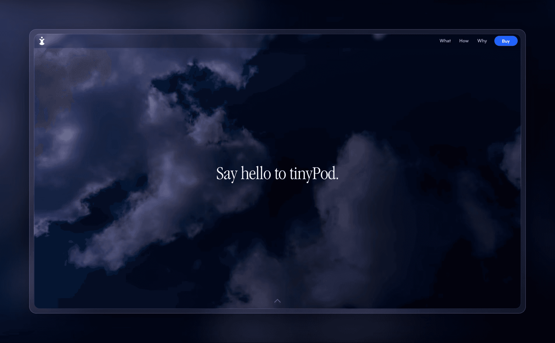
The TinyPod website is a great example of how parallax scrolling can create an immersive experience. It’s designed to showcase the innovation of transforming a strapless Apple Watch into a minimalist phone that looks like an iPod. TinyPod’s website grabs your attention right away. As you scroll, you get a 360-degree view of the product, allowing you to explore every angle in a dynamic and captivating way.
Midway through the page, there’s a clever interactive moment: the TinyPod flips, and a hand appears to hold it, matching the tagline, "Everything you need in the palm of your hand." This well-placed parallax effect not only highlights the product’s key features but also makes you want to keep scrolling, fully drawing you into the experience until you reach the bottom of the page.
2. Mars Rejects

Mars Rejects is a distinctive collection of 10,000 characters brought to life as NFTs. The website’s header features a striking graphic that moves horizontally. As you scroll down, the graphic shifts forward slightly, the background changes to a bold red, and the header text takes center stage.
The parallax effect is also used cleverly in the storytelling section. As you scroll through the story of Mars Rejects, text cards appear while the background image subtly moves forward and transforms. This approach makes the narrative more immersive, pulling you further into the world of Mars Rejects with every scroll.
3. Unifiers of Japan

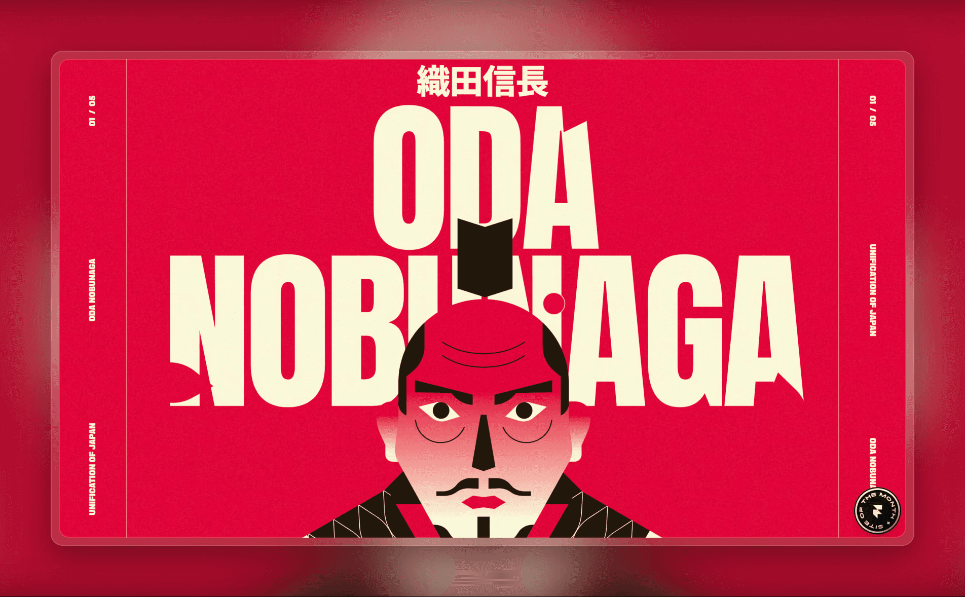
The "Unifiers of Japan" website masterfully uses parallax scrolling to tell the story of Oda Nobunaga, the first great unifier of Japan. As you scroll, the site weaves together the tale of this powerful daimyo who overthrew the Ashikaga Shogunate and ended years of feudal conflict. The experience begins with a stunning header graphic that gradually transforms Oda into a fierce samurai, immediately drawing visitors into the narrative.
The site’s smooth scrolling effect feels almost effortless, making the entire journey through history feel very immersive. This is a perfect example of how parallax scrolling can leave a lasting impression, turning a historical account into a memorable and engaging experience for visitors.
4. Punkt

Punkt’s homepage offers a unique and memorable experience, blending storytelling with eye-catching design. The page starts with a graphic of an envelope that tilts upward and fades away, drawing you further into the narrative. This simple animation sets the tone for the story the site tells—the challenges faced by UX writers.
As you continue scrolling, a line appears in the foreground, with the text "chaos everywhere" subtly fading in the background. This clever use of parallax scrolling not only keeps visitors interested but also clearly shows how Punkt’s platform tackles these challenges, making the website both visually striking and informative.
Original post by Framer


