Inspiration
6 Creative Text Animation Examples Built with Framer

Framer Blog
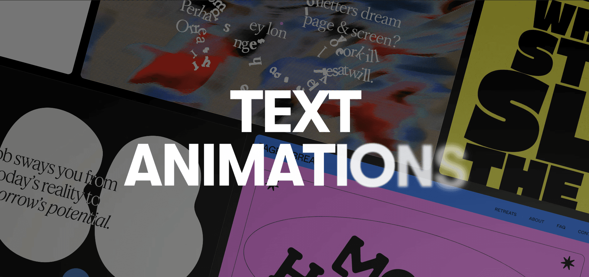
Ever notice how some websites subtly pull you in, even without flashy visuals? It’s often the use of text animations that makes all the difference. While many sites rely on bold graphics, a few stand out by bringing their text to life with smooth, engaging motion.
Text animations are an underrated way to make a site feel more dynamic. When used well, these subtle movements can guide attention, keep visitors engaged, and elevate the overall experience.
We’ve curated 8 creative examples of text animations from real websites built with Framer, showcasing the best ways to bring text to life. Explore how these sites use motion to enhance their designs—and get inspired for your own projects.
1. Floating Letters on Hover — A.E. Studio
The A.E.Studio website, led by creative director Antoine Enault, features a truly unique hover-triggered floating text animation in the hero section. As you move your cursor over the text, the letters break free, floating and rearranging themselves, perfectly echoing the message: "And what if these poor letters dream of freedom from the page & screen..."
This playful, interactive animation encourages visitors to engage with the header, making the experience both memorable and captivating. It not only reflects the studio’s bold approach to creative direction but also reinforces the theme of pushing boundaries and breaking conventions in brand and visual identity design.
2. Evolving Font Styles in Motion — CO-UX
In the header of the CO-UX website, founded by Nicolás Roberto Barrientos, the name CO-UX features a dynamic font-switching text animation. As the text cycles through different styles and fonts, it creates a constantly shifting, eye-catching effect.
This bold animation reflects the collaborative and evolving nature of the CO-UX project, where design teams exchange ideas and outcomes. The changing fonts in the header immediately grab attention, setting a creative tone for the rest of the site.
3. Interactive Color Shift on Scroll — Uroki Tattoo Studio
On the Uroki Tattoo Studio website, the section after the header features bold text that declares "NAJBARDZIEJ UROKLIWE STUDIO W WARSZAWIE" (which translates to "The most charming studio in Warsaw"). What makes this section stand out is the scroll-triggered color-changing animation—as you scroll through photos, the text remains fixed but shifts in color.
This dynamic effect draws attention to the studio’s strong identity, making the text feel alive and responsive to the user’s movement. It’s an engaging touch that reflects the studio’s creative energy and helps create a memorable browsing experience.
4. Shape-Shifting Text Reveal — Ebb Scandinavia
Ebb Scandinavia’s website opens with a compelling text animation in its header section that perfectly reflects the studio’s focus on transformation. Behind the header text, a dynamic background showcases shifting shapes that seem abstract at first. However, as prompted by a hover icon and a note in the corner urging visitors to "scroll to start change," these shapes gradually transform into the word Ebb as you scroll.
This effect cleverly ties into Ebb’s core mission of guiding businesses through change and designing new futures. It creates an interactive experience that draws users in, showcasing the studio’s ability to craft thoughtful, transformative solutions. The smooth transition from abstract to clear reflects their approach to turning complexity into clarity for their clients.
5. Fade-In to Bold on Scroll — Lovi™
The Lovi™ website uses a clever faded-to-bold text animation that kicks in as you scroll, making key details about the skincare app stand out. As the text transitions from light to bold, it naturally draws your eyes to key information about the app and its features.
This animation does more than just look good—it encourages visitors to actually read and absorb the information as it appears. Paired with large, bold fonts, it ensures that users quickly understand what the app offers without feeling overwhelmed. It's a simple yet effective way to keep things clear and engaging.
6. Sleek Hero Text Transition — Adam Kozel
As soon as you land on Adam Kozel's portfolio, the hero text "multidisciplinary designer" smoothly slides to the right, immediately catching your eye. This fluid text animation introduces you to his work in a bold and engaging way, setting the tone for the rest of the site.
Adam, a product designer with expertise in 3D rendering, motion design, and front-end development, uses this animation to reflect his modern design approach. The combination of bold fonts and smooth motion showcases his ability to create clean, visually compelling experiences that make an immediate impact.
5 Ways to Add Motion to Your Website’s Text
Bringing motion to your website’s text can elevate the user experience and make your content more engaging. Framer’s new text effects feature gives you the tools to animate text effortlessly. Here are five ways to use it:
Highlight key information with appearing text
Use Framer’s Appear trigger to make important text pop into view as users scroll. You can apply effects like Scale or Blur to create smooth transitions that emphasize headings or calls-to-action, drawing attention where it’s needed most.
Animate text on hover for interactivity
Framer allows you to add subtle hover-triggered text animations, such as shifting or scaling text when a user hovers over it. This adds an interactive layer to your site and encourages users to engage more with the content.
Create a sequence of animated messages
With Framer, you can design a sequence of text animations using triggers like Appear or Section in View. By adding delays and animating lines or words separately, you can tell a story through dynamic text that flows smoothly as users scroll.
Incorporate text effects into background animations
Framer’s text effects can also work in tandem with background animations. By combining these, you can create text that transforms or changes color as users scroll through different sections, adding a layer of depth and creativity to your design.
Optimize mobile experience with scroll-based animations
Use Framer’s Layer in View trigger to ensure text animations are responsive on mobile devices. This scroll-based effect animates text as it enters the screen, creating an engaging experience for mobile users without sacrificing performance.
Elevate Your Website with Dynamic Text Animations
Adding text animations to your website is like giving your words a personality. Instead of static content, motion helps guide visitors, emphasize key points, and create an engaging experience that keeps people connected to your message.
From simple hover effects to more complex scroll-triggered sequences, these animations make your site feel dynamic and interactive.
Ready to see how text animations can transform your site? Check out our gallery for fresh inspiration, try out a few of our animated website templates, and sign up for Framer to start building a website that moves your visitors in more ways than one.
Original post by Framer


