Inspiration
Beyond the Canvas
4 Standout Portfolio Website Examples in Framer

Framer Blog
You have a collection of your finest work that showcases your achievement and talents. Now, to get it noticed by potential clients, you need a portfolio that genuinely stands out.
Creating an online portfolio is crucial for any freelancer, designer, or agency. In a sea of skilled creatives, your portfolio needs to be distinctive, engaging, and reflective of your personal style. It should highlight what sets you apart and give potential clients a glimpse of what it’s like to work with you.
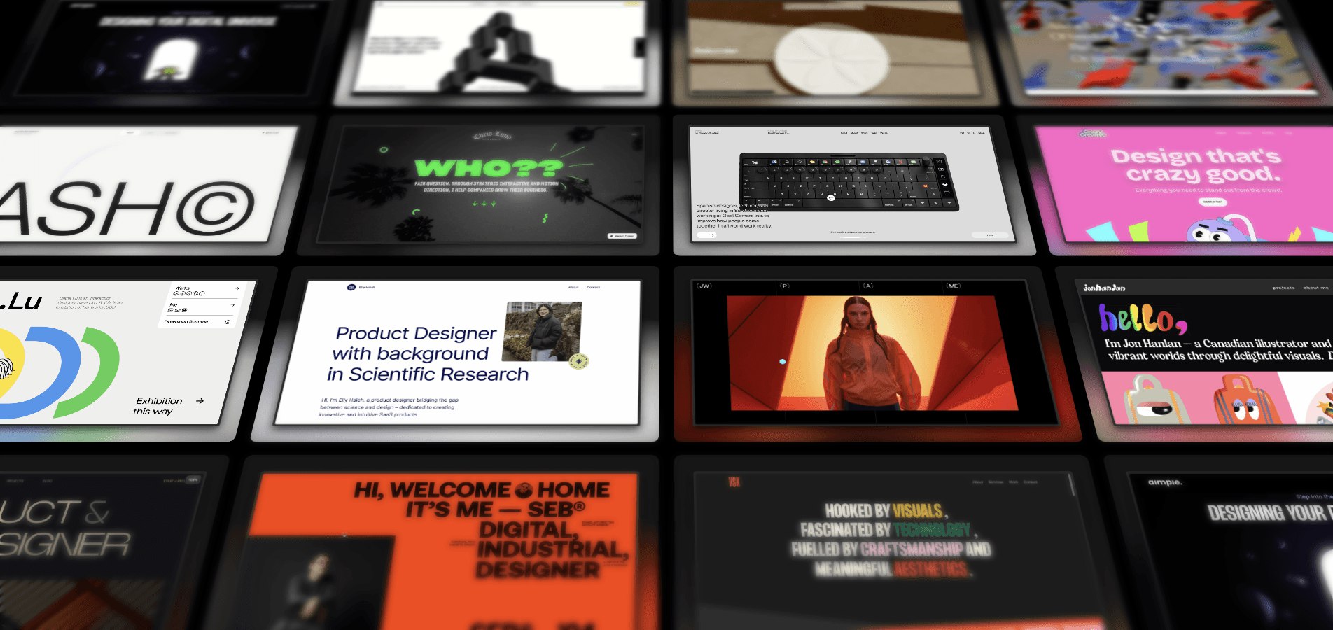
To spark your creativity and inspire your own projects, we’ve rounded up 15 of the most impressive portfolio website examples made in Framer. Explore how they built their websites and the unique experiences they’ve crafted for their visitors to make their sites memorable and delightful.
1. Meris Imamovic — Personal Site
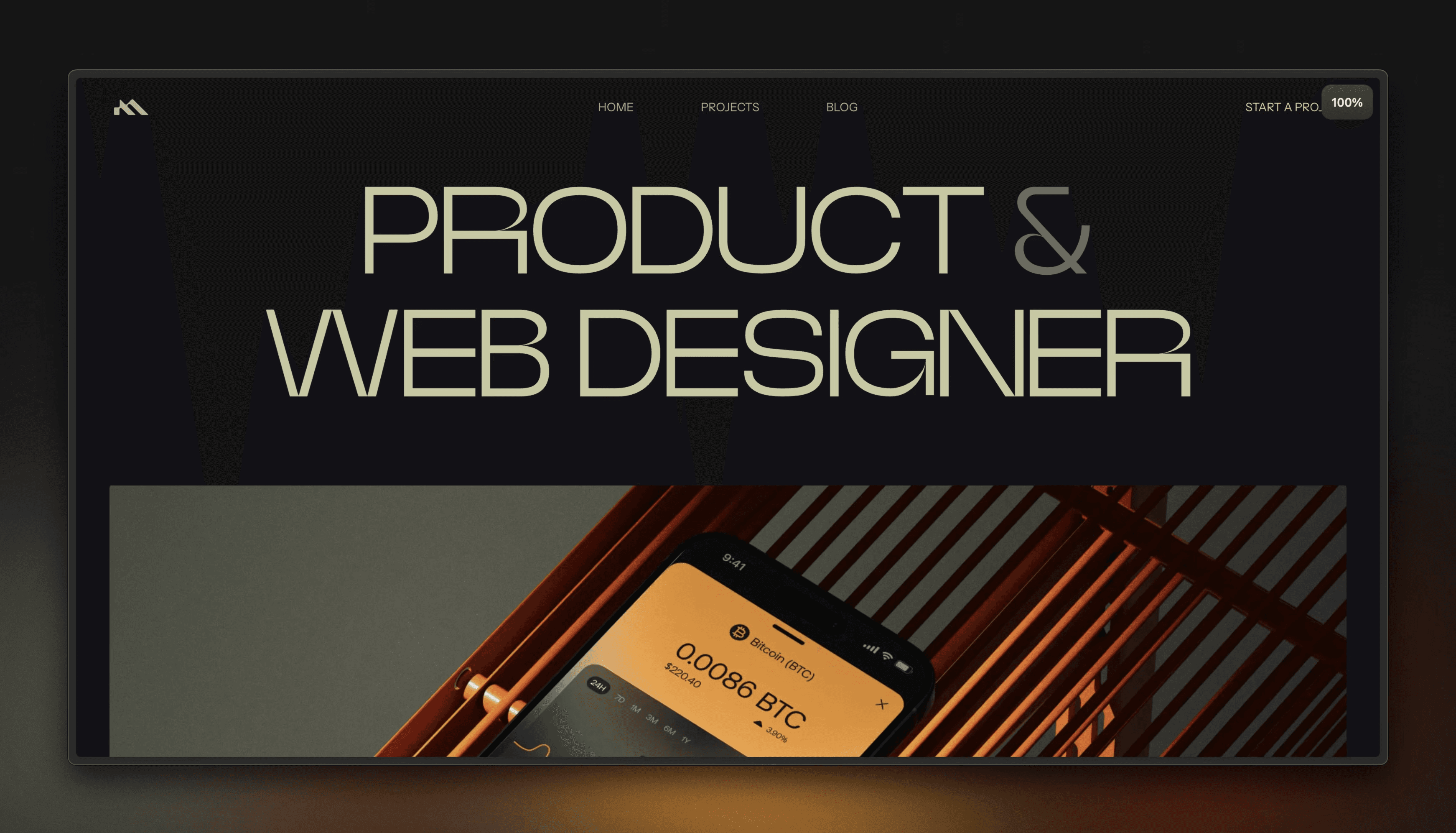
Meris Imamovic’s personal site is a masterclass in minimalistic, neat design. The simple layout makes it easy for visitors to navigate his portfolio. Smooth transitions and interactive elements add a dynamic touch, making the browsing experience engaging and intuitive without overwhelming the user.
2. Claudio Guglieri
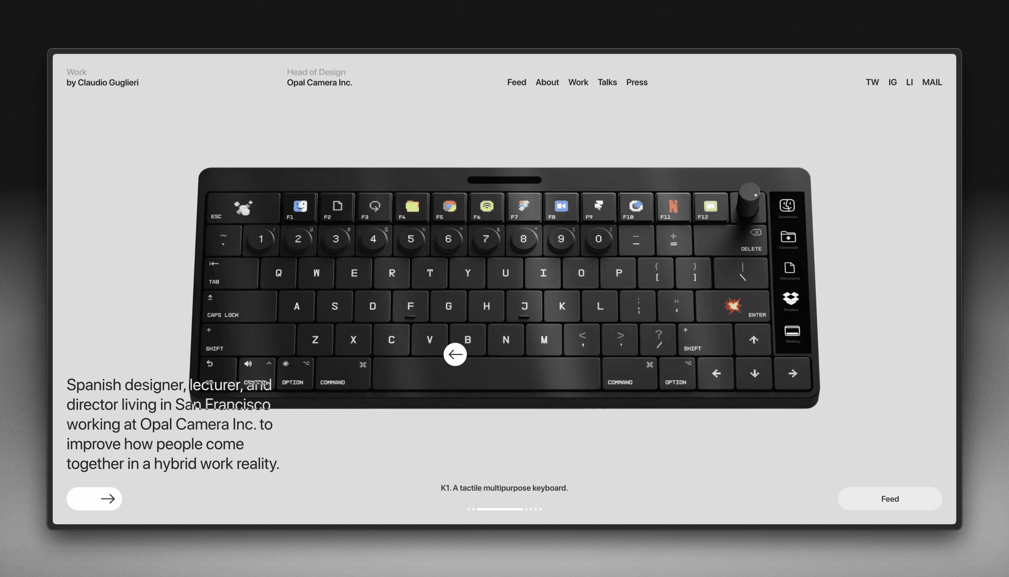
Claudio Guglieri’s portfolio website showcases the power of refined simplicity in design. The header section displays his best work with an interactive carousel. The uncluttered layout throughout the site also ensures his work and achievements are the focal points. This approach highlights his expertise in digital product design and creates an inviting, memorable user experience.
3. aimpie.
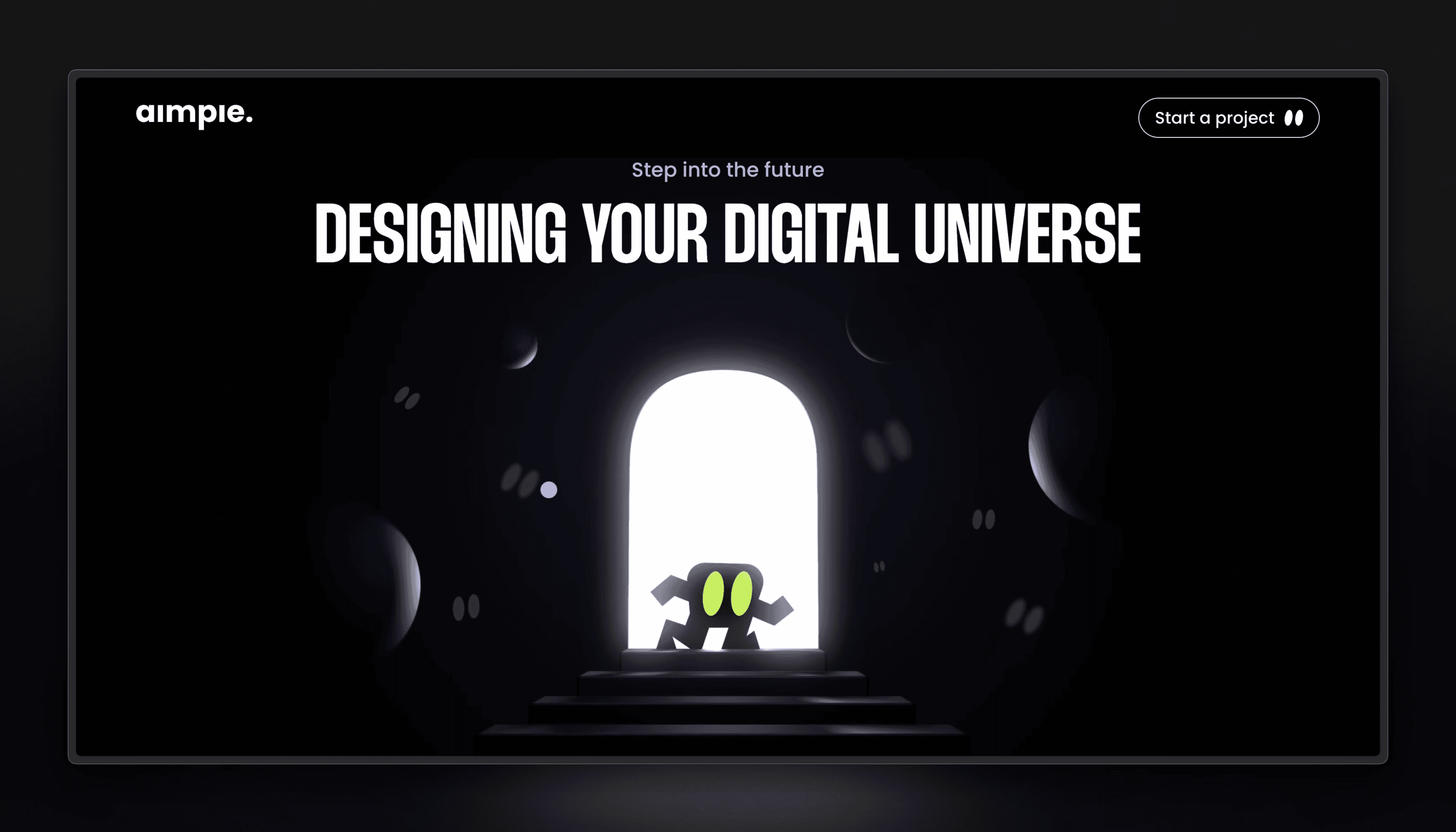
aimpie’s website captures attention with its bold and vibrant design, reflecting the agency’s creativity and innovation. The dynamic animations and interactive elements provide an immersive experience, engaging visitors from the moment they land on the page. The use of large, high-quality visuals combined with a well-organized layout showcases their diverse talents effectively.
4. Antoine Enault
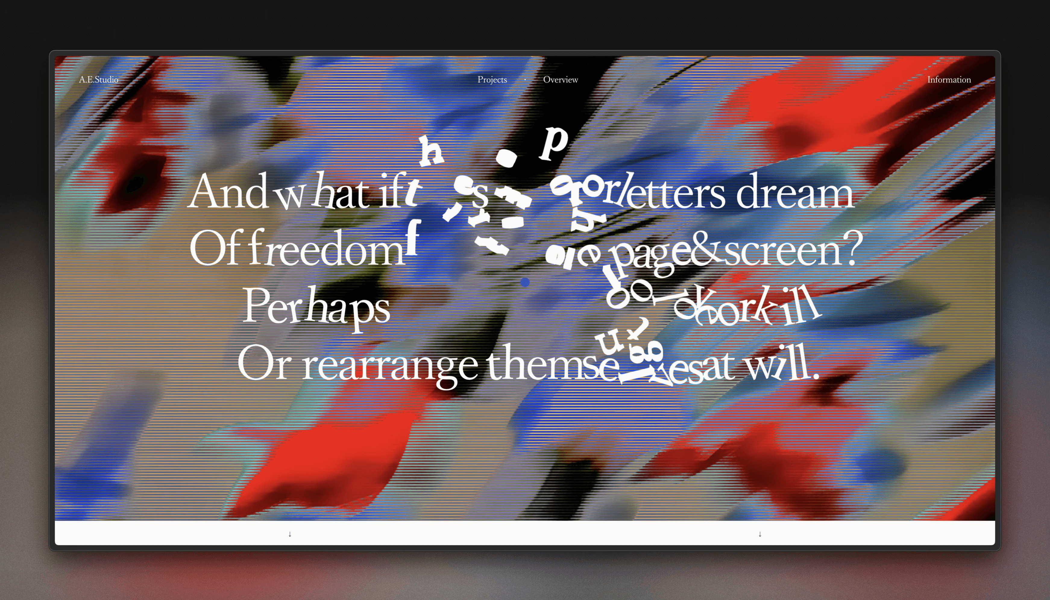
Antoine Enault’s website stands out with its playful and interactive header, where letters move dynamically when your mouse hovers, immediately capturing the visitor’s interest. The overall design is clean and minimalist, making his stunning visual and brand identity work shine. This combination of creativity and usability perfectly reflects Antoine’s expertise in graphic design and visual identities.
Original post by Framer
