Inspiration
Playful Approach to 404 Pages

Framer Blog
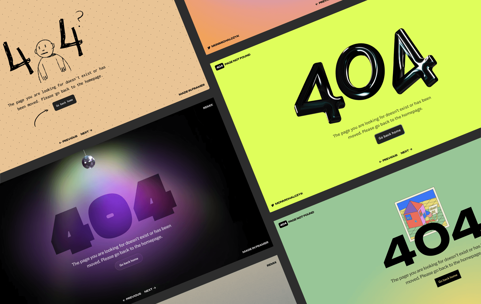
I used Framer to create playful and fun 404 pages that can delight and engage users. In this article, I will share some of my favorite no-code variations that you can remix and customize to suit your needs.
Playful No-Code Variations for Framer Sites
Who says 404 pages have to be boring? I've created a few playful no-code variations that you can use for your Framer sites. With Framer, you can easily remix these projects and customize them to suit your needs. These variations are not only fun and engaging but also help keep users on your site and guide them toward other areas of your website.
Using GIFs in Framer
I love that you can easily use GIFs in Framer. You can just drag and drop your GIF onto your canvas like any other static image! In one particular example, I used a lovely animation created by @YUX that I found on GIPHY. The animation added an element of surprise and delight to the 404 page, making the experience much more memorable for users.
Dreamy Animations with the Blur Effect
In another example, I used the fantastic work from Erica Anderson that I found on GIPHY and added a blurred effect to make it look dreamy. The blur also ensured that the animation scaled nicely for larger displays, making it more accessible to a wider audience.
Original post by Framer


